Apple’s Studio Display Is a Gorgeous 5K Monitor That Doesn’t Disappoint
Apple’s release strategy in the past few years has been confusing and occasionally infuriating. At one point, the tech giant went on an aggressive campaign to grab hold of the professional market. In doing so, it left its core enthusiasts behind. The company flexed its muscles with ultra-premium but prohibitively expensive products like the Mac Pro and Pro Display XDR. Dropping down to the next best thing meant making major sacrifices. Those searching for a desktop were left with the diminutive Mac mini, while the path away from spending A$8,499 on the XDR Pro Display led only to third-party stores outside of Cupertino.
How quickly things can change.
At its “Peek Performance” event, Apple unveiled the Mac Studio, a desktop unit that fits nicely between the Mac mini and Mac Pro, alongside the Studio Display. The monitor, which I’ve been using for about a week, is a successor of sorts to the Thunderbolt Display, a fan-favourite monitor released in 2011 and discontinued in 2016. As such, it is the first sub-$US5K monitor Apple has sold in years.
Apple Studio Display
A 27-inch, 5K monitor
A$2,499 for standard glass; A$2,999 for nano-texture glass (+A$600 for height-adjustable stand)
Bright and vivid, Very sharp, Strong colour accuracy, Elegant design, Powerful speakers, Useable webcam
No HDR support, Limited to 60Hz, Height-adjustable stand costs extra, Only USB-C ports, A bit pricey
Though much cheaper than the Pro Display XDR, the Studio Display is by no means a budget option, coming in at A$2,499 for the glossy model or A$2,999 for a nano-texture glass finish. And if you want a height-adjustable stand, it’ll cost you an extra A$600 (at least a stand is included, I guess). That puts the Studio in the premium category for mainstream consumers where the XDR display is meant for professionals who need reference colour modes and HDR. You may not get the same picture quality, but the Studio Display is, in many ways, a monitor that better suits traditional workflows.
Much of the Studio Display’s value comes not from the 27-inch, 5K panel but the accompanying features that are rarely seen on other monitors. These include a powerful six-speaker system, a 12-megapixel webcam with Centre Stage, and some nifty software perks enabled by a built-in A13 processor. I do have some complaints, the high sticker price being chief one of them. And some features, like HDR, ProMotion, and a height-adjustable stand (see my rant on this below) are simply absent. This is also a standard LCD panel so the picture quality ceiling is below that of more advanced panels.
A sleek design with a stiff walk
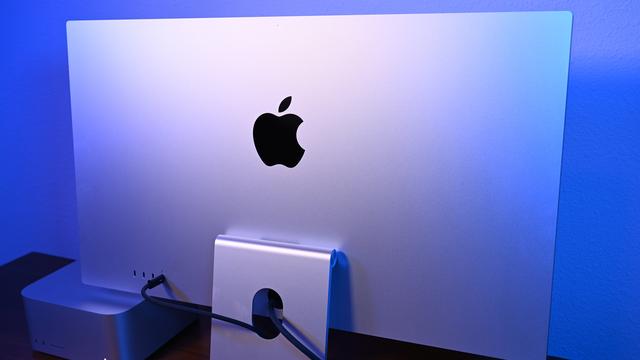
Adhering to Apple’s minimalist design language, the Studio Display has a sleek L-shaped stand made from a single piece of silver aluminium, similar to the one on the Pro Display XDR. It connects to the centre of the monitor at a spherical hinge. The back of the monitor is more conventional than the cheese grater housing on the XDR — only an oversized Apple logo disrupts the smooth silver surface. On the top are vent holes for passive cooling; the rear panel got warm during my testing but never reached concerning temps. Flanking the display are relatively narrow bezels that leave enough space for a 12MP webcam.

The Studio Display inexplicably lacks height adjustment. For that, you need to pay an extra $US400 ($555) for a completely different stand. Perhaps Apple thinks some folks won’t need it; whatever the case, a height-adjustable stand should be table stakes at the base price. To make matters worse, the stand options aren’t interchangeable, meaning what you buy is what you get. What you can do with the standard stand is tilt the screen from -5 degrees to 25 degrees, which was more effective in providing an optimal viewing angle than I had anticipated. That said, if, like me, you need to stretch your legs and stand at various times throughout the workday, then prepare to spend extra or go with a VESA mount.
The Studio Display is plug-and-play. As much as I’ve complained about the stand, at least this device comes with one (unlike the Pro Display XDR), along with a one-metre-long nylon USB-C cable. And everything is already put together, no assembly is required. There aren’t even any buttons. Not one. The Studio Display runs entirely on software. It senses when you plug the USB-C into a Mac or PC and powers up automatically. The monitor is also lightweight at only 8 kg, and therefore, easy to carry to another room or set aside as you rearrange your office.
Photo: Phillip Tracy/GizmodoLike those on the Mac Studio, the Studio Display’s rubber pads failed to keep the monitor planted to my wooden desk. It slid around as I inserted or disconnected cables from the rear I/O. Speaking of ports, there is one Thunderbolt 3 input with 96Wh charging–enough power to juice up my MacBook Air M1 and several Windows PCs I’m currently testing. The three ports without the Lightning icon are standard USB-C inputs capable of 10Gb/s transfer speeds.
That’s it, though. Video output can only be achieved through USB-C, not HDMI or DisplayPort. And besides those USB-Cs, the monitor doesn’t augment the ports on your desktop or laptop. That might not be an issue for the Mac Studio or the latest MacBook Pro models but I would have gladly welcomed a USB Type-A for ultra-thin devices like the MacBook Air.
One gorgeous panel (despite some omissions)
The 27-inch, 5K (5120 x 2880-pixel) Retina display has all of the qualities I look for in a good panel. Text appears sharp, graphics and icons pop with rich colours, and the screen is plenty bright. You might think, “well, this is only 600 nits compared to the 1,600-nit XDR Display.” True. But the Studio Display is brighter than most of the competitors, and I can’t imagine anyone needing to go beyond its capabilities unless they work in an exceptionally bright workspace. I kept the screen at around 85% brightness in my dimly-lit office; any brighter and I’d need to squint. My colorimeter clocked the centre of the panel at 603 nits but there is some dropoff at the edge, which peaked at 520 nits.
Photo: Phillip Tracy/GizmodoApple did a good job of calibrating this panel so that the white balance and colours appear accurate out of the box. It’s just really pleasant to look at. I cycled through those 4K wildlife videos you’ve probably watched on the back wall of a Best Buy, and the sharp details and vivid colours looked phenomenal. Viewing angles are excellent and, in my opinion, Apple chose the goldilocks size for a work/play monitor by opting for a 27-inch display.
Keep in mind that this is a standard IPS panel so you won’t get the perfect black levels found on an OLED screen nor do you get HDR support for greater contrast. I placed the HP Spectre x360 16’s OLED display side-by-side with the Studio Display and my eyes were drawn to the laptop. Blacks on the monitor looked dark grey in comparison, and the colours didn’t have the same wet paint-like saturation to them as those on the Spectre. I also wouldn’t use the Studio Display as a gaming monitor considering the measly 60Hz refresh rate. That’s standard for a screen of this resolution, but part of me was hoping Apple could find a way to add ProMotion.
Photo: Phillip Tracy/GizmodoThe Studio Display supports nine reference moves designed to let users pick specific colour profiles tailored to their unique workflow. The default “Apple Display” covers the P3 colour gamut and allows for a full 600 nits of brightness. This mode is best for home and office use, your typical day-to-day operations. There is an “Internet and Web” mode that uses sRGB and is fixed at 64 lux. You can learn about the other modes here. What these do is adjust the monitor’s colour and brightness to different requirements, so artists, photographers, videographers, and the like have the best possible environment based on the content they are editing or creating.
Loaded with extra features
Built into the monitor is a six-speaker system consisting of four woofers and two tweeters. The sound quality is better than anything I’ve ever heard out of a monitor. Listening to Tim Atlas’s “Tangerine,” I was immediately struck by how deep the bass notes reached. If anything, the low end bled into the velvety vocals and simple instrumentation, causing the midrange to sound slightly bloated. Limitations aside, I wouldn’t feel a need to buy a Bluetooth or bookshelf speaker–the display gets loud without distorting, thumps deep bass, and Spatial Audio with Dolby Atmos does a good job with sound separation.
Photo: Phillip Tracy/GizmodoThe other big built-in feature is a 12-megapixel webcam with an f/2.4 aperture and an ultra-wide 122-degree field of view. It’s…fine. But that’s about it. I snapped a selfie with some studio lights filling my room and the camera accurately captured my rosy skin tone and taupe long sleeve while keeping my face evenly lit.
Photo: Phillip Tracy/GizmodoBut the image was noisy, even when I viewed it on my Macbook Air. I’d still use this instead of my Logitech C920 on Zoom calls; it isn’t as good but it’s good enough that connecting an external webcam wouldn’t be worth the hassle. Oh, and the webcam supports Centre Stage, which automatically pans to keep you or other video call participants centered in the frame.
Bringing these software features to the monitor is an A13 Bionic chip, the same one found in the iPhone 11. It adds Siri to Apple’s desktops, which lack a voice assistant. I do wish Apple had done more to harness such a powerful chip, like adding Face ID for instant and secure log-in or integrating Apple TV in some way.
Should you buy the Studio Display?
I’ve thoroughly enjoyed using the Studio Display over the past week or so. The 27-inch, 5K panel is sharp, bright, and vivid, and the screen’s beauty is paired with an elegant design. It augments the basics with some features you won’t find on every monitor, including a 12MP webcam and speakers that are actually worth a damn. Does it justify the price? My first reaction was that $US1,600 ($2,221) was far too expensive for a non-HDR LCD monitor with a slow refresh rate and a rigid stand.
Here’s the thing, though: the Studio Display doesn’t have much competition. There are very few 5K monitors on the market, and those that do exist are either stupidly large, stupidly expensive, or both. And if we take a step back, the closest rival, LG’s 27-inch Ultrasharp (which has been banished from Apple’s store, by the way), costs “only” $420 less than the Studio Display but doesn’t get as bright, doesn’t look nearly as good, and doesn’t have any nifty macOS features. If you can stretch the budget, the Studio Display is the better choice.
In the end, the Studio Display will satisfy Apple enthusiasts and professionals who want a sharp, colourful monitor with top-notch build quality. If you aren’t a creative pro who works with high-res assets, I’d suggest looking at 4K monitors. You could go with one (or two) of the many cheaper options or splurge on a monitor with superior display technology, like Alienware’s new 34 QD-OLED (AW3423DW). But I won’t blame you for going with Apple–the Studio Display is a first-rate monitor that successfully fills a gaping space left by the long-extinct Thunderbolt Display.


