I wanted to like Lenovo’s new Nook. Here’s why I didn’t.
The new Nook is not a full-fledged e-reader — it’s a budget tablet with slightly specialized software. It lives in between these two worlds, attempting to pull the best from each, and because of this, it loses much of its identity (and its functionality).
The Nook has been around for more than a decade now. Barnes & Noble got into the e-reader game not long after Amazon did, and for quite a few years the bookseller’s Nook lineup was comparable to the Kindle. Both companies innovated upon the canvas of E Ink screens, golden backlights, and virtual bookstores, but it’s safe to say Amazon’s sheer scale gave the Kindle a huge advantage.
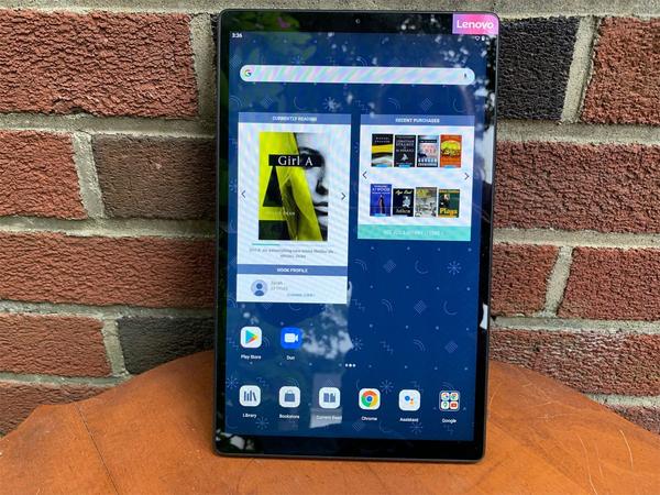
Barnes & Noble’s latest Nook is a 10.1-inch tablet that’s manufactured by Lenovo and starts at $129. From its very unboxing the Nook feels confused in its identity: Lenovo Tab M10, the box reads, although there is also a round sticker proclaiming the device as a Nook. My first thought upon holding the device is that it does not feel like an e-reader, with its smooth metal back and its tall, glossy screen. It reminds me most of the Galaxy Tab A my father uses to browse the web.
As far as e-readers go in 2021, the new Nook works as a basic reading device and is passable as a tablet so long as you can tolerate an old, bloated, and laggy Android interface. But why put yourself through this kind of stress when there are better and cheaper e-readers and budget tablets available? As a voracious reader, I wanted to like the new Nook, but it’s not worth your time or money.
Lanky tablet body
The new Nook’s all-metal body is sturdy and light; it weighs just under a pound, which means it’s easier to tote around than a hardcover. The back is a dark, matte grey reminiscent of Apple’s space gray hardware, while the front is almost all screen. The black bezels basically disappear when the screen is off, and when it’s on, they’re just thick enough to rest your thumbs on without accidentally swiping to the next page.
As a whole, the hardware here is definitely more tablet than e-reader. Held in portrait orientation, the new Nook is much taller than it is wide because of the display’s 9:16 aspect ratio; this is unusually long compared to book pages that are typically 3:2 or 4:3. Next to my base-model iPad, that tallness gives it a surprisingly sleek look. In my hands it feels a little unwieldy for a book device, though. Its size makes it nearly impossible to use one-handed — I didn’t realize quite how often I read like this until I couldn’t anymore. Even gripping it with two hands toward the bottom of the device is a little bit uncomfortable.
Reading text on webpages is difficult on the low-quality display.The screen itself, an IPS display with 1,280 x 800 resolution, is very hit or miss. It’s plenty clear for reading books with the text size either set to average or large; using the Nook for any other purpose not so much. Watching videos on here might’ve been fine in 2012 or so, but the experience is consistently lackluster. Reading text on webpages is difficult on the low-quality display. Once or twice I had to check whether I’d forgotten to put my glasses on.
The cameras — one on the front and one on the back — are fine. I don’t think anyone is buying an e-reader for taking pictures and videos, but I’m sure some people will try once they see it’s an option. The front-facing 5-megapixel camera reminds me a lot of trying to take selfies with my iPod Touch in middle school, which is to say it works but will make people wonder whether or not you took them using a potato.
In terms of battery life, you’re looking at a pretty standard 10 hours of total screen time. I did find that the battery drained pretty quickly in standby, unlike the low power-consumption of an idle E Ink device. This could pose a problem if you stretch your reading sessions out over a period of some days; you’ll have to recharge a couple of times to finish the book.
So much lag
The new Nook runs a modified version of Android 10. This opens up the tablet to Google’s enormous ecosystem of apps, so you could theoretically use this e-reader as a navigation device, an entertainment center, a word processor, and a calendar, if you want. As of now, Lenovo doesn’t have any plans to update to Android 11 or beyond.
What makes this tablet more than a plain old Lenovo Tab M10 is the Nook home screen, which allows for quick access to the Nook Store, your full library of books, and shortcuts to books you’re in the middle of. This Nook screen is the first thing that greets you when you unlock the device and serves as the centerpoint of the tablet experience. It achieves this purpose well and it’s very easy to navigate. Not the most modern interface, mind you, but it gets the job done.
The Nook interface comes with an unfortunate side effect, though: the rest of the device becomes fickle and frustrating. It’s nearly impossible to multitask with the device’s two-year-old version of Android paired with a bottom-tier MediaTek processor — and even working on a single task is a pain.
There’s lag every time you tap an app icon; there’s more lag when you try to open the keyboard to perform a search. Overall, the experience feels bloated and annoying. On more than one occasion the Nook froze up for 30 seconds or more while attempting to switch apps. The Nook might look and feel like a tablet, but it’s so bad at basic tablet things (not a very high bar in 2021). Moving around the Nook interface is smooth — but even returning to the home screen from an open book presents lag issues.
An entirely different frustration: I found myself completely unable to transfer ebooks to the device directly from my computer. The Nook does not show up in my MacBook Air’s file explorer, and Calibre (the world’s most popular ebook management software) couldn’t find it, either. I even downloaded the latest version of the Android File Transfer software — still nothing. Maybe I could’ve figured out a workaround with more dedicated research, but I shouldn’t have to go down rabbit holes to manage my ebook library on a brand new e-reader.
The bright spot in all this is that the Nook reading software does its prescribed job of opening ebooks. There’s a pleasantly familiar page-turning animation that’s consistently smooth, bloated operating system be damned. I never ran into any clarity issues while using the Nook app (unlike in the web browser), and formatting adjustments like font size were all effortless. The Nook app is just that: the Nook app. There aren’t any added bells or whistles. It’s the same app you can download on your smartphone or any tablet. The screen is bright and certified with low levels of blue light; I didn’t feel any eye strain while reading.
Master of none
Lenovo’s take on the Nook is confusing. It certainly looks and feels like a tablet, but it’s not very good at actually being a tablet. Even basic functions like opening the settings app are laggy and imprecise and browsing the web becomes an exercise in futility if you’re not careful. Barnes & Nobles’ hand in the equation is near-invisible.
The best thing you can do with the new Nook is read — which makes sense, given that it’s marketed as an e-reader. But this, too, is a stunted experience. Its lanky body makes it a little strange to hold while you’re reading, and it’s impossible to really use one-handed. The screen is fine for reading, but it’s not very sharp, and it’s definitely not as paper-like and easy on the eyes as E Ink.
Overall, the experience feels bloated and annoying.The problem is that there are plenty of e-readers available that are so much better. Rakuten’s Kobo e-readers, for example, start at a lower price and include top-notch E Ink screens, super long battery life, and overall provide a much more sustainable reading experience. Amazon’s Kindles do the same. A serviceable reading experience isn’t enough — not in 2021.
There’s also an entire market of low-budget tablets, like Amazon’s Fire line and Samsung’s Galaxy Tab. These tablets come in at a similar price point with more robust hardware. And you can install the Nook app on those, too. You don’t get the Nook home screen as soon as you turn them on, but you’re not missing out much without it. The market is dominated by devices that have the reading experience honed to near-perfection. Most consumers, I think, will go for an E Ink screen if they’re hoping for the best reading experience at this price point, or they’ll buy a budget tablet, if they’re more interested in web browsing or watching Netflix. The Nook is neither the best for reading nor is it good at tablet functions — it tries to be the jack of trades, but like so many devices, is the master of none.
Input may receive a portion of sales if you purchase a product through a link in this article. We only include products that have been independently selected by Input's editorial team.
Nook 10" HD TabletBarnes & NobleThe Nook 10" HD Tablet... works... but there are too many better options for reading ebooks, like a e-reader or any other Android tablet that's faster.

