Samsung’s Galaxy Tab S7 and S7+ are a pair of Android tablets worth your attention
We’re not going to bury the lede here: Samsung’s Galaxy Tab S7 and Tab S7+ are fantastic Android tablets. In fact, we just named the Tab S7 the best Android tablet of 2020.
Granted, the number of Android tablets that compete with the Tab S7 and S7+ are almost all from Samsung. Last year’s crop of Tab S6 models left us wanting more, and with the Tab S7 and S7+, Samsung delivered.
You can buy the Tab S7 or Tab S7+, with configurations starting at $649.99 and $849.99, respectively. That gets you a tablet and Samsung’s S Pen in the box, with 128GB of storage.
It’s obvious by now that we enjoyed using both tablets over the last few weeks, and while they’re fantastic Android tablets that benefit from Samsung’s enhancements, they’re not perfect.
Let’s talk about the elephant in the room: The Tab S7 and S7+ look a lot like Apple’s iPad Pro. If it wasn’t for the 16:9 widescreen aspect ratio, it’d be almost too easy to get the two devices confused.
The S7s have square edges, with the volume and power buttons on the right-hand side and a USB-C port on the bottom that’s used for charging or transferring data.
On the left-hand side, or the bottom when the tablet is docked in Samsung’s Book Cover Keyboard accessory, are three pogo pins that are used to power the keyboard and provide a pathway for data to go between the two devices. A back cover for the tablet is included with the Book Cover that magnetically attaches to the back of the tablet, and it even has a place that protects the S Pen, which also happens to magnetically attach to the tablet.
The Tab S7’s display measures 11 inches, while the S7+ is larger at 12.4 inches. The added screen real estate on the larger model not only gives you more room to work on the screen, but it also means the keyboard accessory has more space.
Either keyboard is fine to type on, but the smaller version does feel cramped, and we were more prone to typos for the first few days of use.
Perhaps our favorite design aspect of the Tab S7 is the front-facing camera, which is now centered on the tablet when you’re holding it in landscape mode. It’s great because you no longer have to look off to one side of the screen when you’re on a video call, and it keeps you centered at all times. It’s a small but important tweak to the design, especially with the number of video calls we all find ourselves on right now.
Overall, the design of the Tab S7 and S7+ is familiar but with Samsung’s thumbprint. That said, we would have loved to see Samsung use the same design approach as the Galaxy S20 or Note 20 phones on the Tab S7 line. Now that would have been something special.
For the most part, the Tab S7 and Tab S7+ are the same tablets. Both devices come with Android 10 and Samsung’s One UI proprietary interface, with full Google support. Both tablets are powered by a Qualcomm Snapdragon 865+ processor; have storage options of 128GB, 256GB or 512GB; have displays with up to 120 Hz screen refresh rate; feature optional 5G connectivity; have support for 45-watt fast charging via the USB-C port; and come with an S Pen stylus in the box.
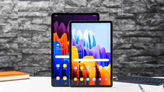
Where the S7 and S7+ begin to diverge are display type, screen size, memory and battery life. The S7+ uses Samsung’s Super AMOLED display and measures 12.4 inches, while the S7 is 11 inches and is an LCD display. On paper, the S7+ should be the clear winner, offering brighter colors and more vivid pictures compared to the S7, but in use, the two displays looked almost identical when playing the same video.
The S7+ has 8GB of memory, while the S7 has 6GB of memory, meaning the S7+ will be better suited for multitasking or keeping apps open in the background for longer, an especially important factor when you start using Samsung’s DeX software that transforms the standard Android interface into a laptop-like interface. You can automatically trigger by connecting either tablet to Samsung’s keyboard accessory, which is sold separately, starting at $199.
DeX is an interesting approach to fixing the Android app problem that all Android apps fall victim to. Specifically, the vast majority of Android apps aren’t optimized for tablets. For example, instead of opening an app and seeing multiple columns, as you do with Gmail with your inbox on one side and the body of an email on the other side of the screen, you’re stuck with the phone version of an app, only bigger. The end result is a lot of wasted space, and not an efficient experience.
That changes when you dock either Tab S7 into Samsung’s keyboard accessory; it automatically triggers DeX and switches the interface to look more like a Windows 10 or Chrome OS layout. There’s an app dock along the bottom, showing you which apps are currently open and an app drawer you can use to open more apps.
But where DeX shows its potential is with the ability to run multiple apps at the same time in different-size windows, instead of snapping the apps to specific sections of the screen. In other words, the DeX desktop with multiple windows open looks and works almost exactly like a full-blown laptop.
And for the most part, it’s great. The familiarity of managing multiple windows and multitasking between them makes the transition smooth. But where the experience begins to struggle is with Android apps that aren’t optimized for DeX. Chrome, for example, doesn’t default to desktop mode. Instead, you have to manually switch out of the mobile version of the browser to access the desktop version of a website. With other apps, like Geekbench 5, you can’t resize their windows. There is a tool built into DeX Labs that will force the app to resize, but it’s strictly for moving in and out of full-screen mode, and it requires you to restart the app every time you want to go from a window to full screen or vice versa. That’s not ideal, especially if you’re in the middle of a project and have to worry about losing work.
Don’t get us wrong: There’s a lot to like about DeX, and we much prefer it over using standard Android apps on a tablet, but we do wish it was a smooth experience across all apps and services.
One more difference between the two tablets is that the S7 has a fingerprint sensor built into the power button, while the S7+ has a fingerprint sensor built into the display. It comes down to personal preference about which one you like better, as they both perform the same. When the S7+ is docked into the keyboard cover, the fingerprint reader is on the right-hand side, about halfway up the screen. It makes it easy to reach up and press your thumb on it, while the S7’s fingerprint reader is on the top edge of the tablet and is somewhat awkward to access.
Outside of screen size, battery life is probably the biggest difference between the two. The S7 has an 8,000mAh battery, and the S7+ has a 10,090mAh battery, but don’t let the battery size fool you. During our benchmark battery test that consists of playing a video on repeat with the tablets in airplane mode and screen brightness set to 50%, the S7 lasted 15 hours and 22 minutes, while the S7+ gave up after 10 hours and 5 minutes. In other words, the S7’s battery will last all day and well into the next, while the S7+ should be enough to get through a full day of use.
Performance on both tablets, as a normal Android tablet or in DeX mode, was smooth as silk. No, really. We never experienced any hiccups or issues with apps opening slow or stuttering, even when we had multiple apps open.
As we do with any device we test, we ran Geekbench 5, a benchmark app, to quantitatively measure how the tablets perform. Because the tablets are so similar, it didn’t surprise us that they performed almost identical to each other. The Tab S7 scored 969 on single-core and 3,193 on the multi-core test. The Tab S7+ scored 964 and 2,742 for the same tests, respectively. The difference between the multi-core scores is likely due to the differences in display resolution and size, but in daily use, we didn’t notice any performance differences between the two.
Compared to previous Galaxy tablets, the Tab S7 and Tab S7+ offer a more complete package. From battery life to performance to display quality, there’s no real comparison, and better yet, you can pick which device fits your needs based on size and have confidence that you’re getting a quality experience either way.
Android tablets are scarce, but that shouldn’t take away from what Samsung has achieved with the Tab S7 and Tab S7+. They’re both solid tablets that integrate with Google and Samsung’s ecosystem of apps and services.
The decision about which Tab S7 you should get comes down to screen size and how much you want to spend. The best bang for your buck is the smaller Tab S7, which is why it’s currently CNN Underscored’s best Android tablet of 2020.

