Windows 11 Tablet Users: Get Ready to Relearn Everything
Windows 11 changes everything for tablet PC users. Up until the new OS was released, I had been happily using Windows 10 on a small, inexpensive Surface Go in Tablet Mode (with no keyboard) ever since that device debuted three years ago. I used it recreationally for looking things up on the web while watching TV and grazing from news, email, and sports sites. With Windows 11, as you'll see below, the tablet experience is completely different.
In fact, Microsoft decided to jettison the notion of a Tablet mode completely. In Windows 10, you can explicitly set a device to Tablet mode, but with Windows 11, that choice is gone. Instead, PCs automatically switch to a more touch-friendly mode once you remove the keyboard. The taskbar icons space out a little more, and some new gestures become available. Here’s a look at what you can expect when using Windows 11 on a tablet.
The New Way Windows 11 Works on Tablets
Using Windows 11 on a tablet is much more akin to using it on a desktop, whereas Windows 10's Tablet Mode has a unique feel. You see the similarities between Windows 11 on a tablet and desktop in the taskbar and in how application windows appear.
The Windows 11 taskbar is more condensed when you're using a tablet with the keyboard attached (top) and more spread out once you detach the keyboard to use it in touch mode (bottom).When you pull off the keyboard from a tablet or fold back the keyboard on a convertible laptop, the icons on the taskbar space themselves out more. The image above shows the difference. It’s subtle but helpful. Note that the Notification icons remain small. By contrast, in Windows 10’s Tablet mode, taskbar icons disappear, since apps run full-screen; in that OS you have to use the Start menu or Task View to switch apps.
In Windows 11, you get the same rounded-corner windows you would on any desktop apps, with options to set them to full-screen view. Oddly, touch mode doesn’t support Snap Layouts, the new window layout options that appear when you tap a window’s maximize button. You can only full-screen or resize, though you can drag a window title bar to a side or corner of the screen to make it fill exactly one half or one quarter of the screen. Although full-screen apps make sense on a handheld device, I don’t have a problem with the greater flexibility Windows 11 offers here.
Windows 11 Tablet Gestures
To show Task View, you swipe up with three fingers in Windows 11.Swiping in from the sides of the tablet has changed in Windows 11. In Windows 10, swiping in from the left side opens the Task View, letting you easily switch among open apps. I use that all the time on my Surface Go. In Windows 11, swiping in from the left opens the Widgets panel. Swiping in from the right in Windows 10 lets you access frequently needed quick settings like Rotation Lock and Screen Brightness. Now in Windows 11, you just get the notification panel. Getting to those crucial quick settings in Windows 11 requires tapping of one of the three icons along the right screen edge.
Windows 11 adds some completely new gestures. One of these—swiping up with three fingers—lets you enter the Task View. If you’re holding a tablet by the sides, this gesture is less convenient than swiping a thumb in from the left. It forces you to hold the tablet with one hand, which isn’t the best with larger and heavier tablets. You can still tap the Task View icon in the taskbar, which might be easier though it’s a less natural movement than a simple swipe.
In Windows 10, swiping one finger down from the top of an app fully closes the app. Windows 11 doesn't have this function and there’s no new gesture to replicate it; you tap the X in the top-right-hand corner of the window to close an app just as on the desktop.
You can, however, minimize apps by swiping down with three fingers. That gesture actually minimizes all open apps to show the desktop. If you minimize apps this way, swiping up with three fingers now restores them on screen. That means the same gesture, swiping up with three fingers, does two different things: Sometimes it restores an app, and sometimes it shows Task View.
Swiping side-to-side with three fingers switches you between open apps, which doesn’t seem any more convenient than simply tapping the program’s icon in the taskbar, though some may find it useful. Again, in Windows 10 my go-to action is to swipe in from the left and pick the app I want from Task View.
One more new gesture lets you switch between multiple desktops: swiping left or right with four fingers. This makes some sense and is similar to switching among multiple virtual desktops on macOS, which has a larger library of gestures for its trackpads that are consistent and unambiguous. Unfortunately, that OS doesn’t extend the gestures to direct use on touch screens.
You can still scroll by dragging two fingers and zoom in and out by spreading and pinching two fingers, the way it works on just about every touch screen on every platform. And I appreciate that you can swipe back and forth in web browsing history with one or two fingers moving left or right.
Using a Stylus With Windows 11 on a Tablet
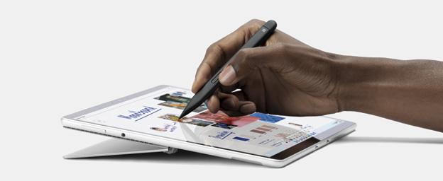
Using a stylus with a Windows tablet continues to bolster productivity and creativity, although the way you use a stylus has changed in Windows 11. I tried out a Surface Slim Pen 2, which nicely tucks into the Surface Pro 8’s detachable keyboard.
Different styluses have different capabilities, but by default, clicking the Surface Slim Pen 2’s top button opens the Whiteboard app. You can change this default to OneNote, Snipping Tool (for screenshots), or any program of your choice.
The 10 Worst Things About Windows 11Windows 11 vs. Windows 10, Play-Tested: Will an OS Upgrade Boost Your Gaming Performance?The Best Windows 11 Tips and TricksDouble-tapping the top button of the stylus takes a screenshot by default, but again, you can make it open whatever app you like.
You can set the Surface Pen buttons to open whatever apps you like.The side button on the stylus is sort of like the right mouse button, opening context menus, but it also lets you drag items around the desktop.
Where stylus input really shines on Windows 11 is for writing text. Even my sloppy and illegible handwriting was more often than not perfectly interpreted by the touch keyboard’s Handwriting mode. I will say that it works better in OneNote, Microsoft To-Do, PowerPoint, and simple web text entry boxes than in Word, where the pen is better used for markup. For that reason, tablet users may be better off writing by using Word’s excellent speech input than with a stylus.
A stylus or pen really comes into its own for drawing and markup, and it’s hard to beat when you need to sign a digital document. The new Pen sports 4,096 pressure levels, haptic feedback, and Zero force inking, meaning writing and drawing appears on the screen instantly. Apple doesn’t disclose pressure level specs for its Pencils, which also lack any control buttons.
Will Tablet Users Bite?
Maybe it’s just a matter of getting accustomed to the new gestures and processes, but Microsoft isn’t doing itself any favors by changing how you use the tablet so drastically from Windows 10 to 11. We actually prefer using a tablet running Windows 10 to using an iPad, because of the super convenience of swiping in from the sides for my most-needed functions.
That said, the existing Windows 10 in Tablet Mode never threatened the iPad’s dominance in the tablet arena, and perhaps these changes are an attempt to make Windows tablets more competitive. We can hope that Microsoft improves the way Windows 11 works for tablets in future updates, perhaps bringing back some options that made it so good in Windows 10.
Sign up for Tips & Tricks newsletter for expert advice to get the most out of your technology.
EmailThis newsletter may contain advertising, deals, or affiliate links. Subscribing to a newsletter indicates your consent to our Terms of Use and Privacy Policy. You may unsubscribe from the newsletters at any time.
Thanks for signing up!Your subscription has been confirmed. Keep an eye on your inbox!

